An Autumnal Shift
Less fluff, more intention
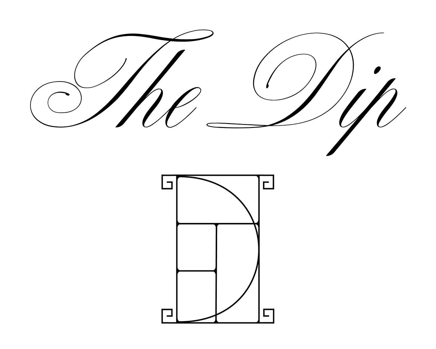
Hi all! Like clockwork, I was craving a slight update to the overall visuals of my Substack and logo. Something more masculine, something slightly more minimal, more art deco - a visual identity that better represents me. And the nudge towards a more streamlined look is something that happens every autumn. It’s an internal shift that spills into my wardrobe, how I decorate my house, down to even how I want my Substack logo to appear. Less fluff, more intention. A time to shed what no longer serves us and pair it down to what truly resonates with us. Designing the new logo on my own was such a fun creative exercise - I highly recommend all of us take part in a project that pushes us outside our comfort zone from time to time.


